 The human brain is quite amazing. It can take an incomplete image and fill in the gaps to create a complete picture. Research suggests that your brain processes the insertions it makes as if it had actually seen the complete picture. Look at the image on the right, for example.
It may take a moment, but you should begin to see a dalmatian dog sniffing the ground. Although all that’s really there are some black blobs and splatters, your mind fills in the gaps and can pick out a sensible image. Given just enough content, your mind fills in the gaps with its own context.
Context is critical for evaluating your institution’s fair lending performance. When it comes to fair lending, many institutions leave the picture of their performance incomplete—they know their own numbers, but they fail to give these numbers context based on a comparison to such factors as population, income, age, gender, etc.
Analyzing your fair lending data in the right conditions in the correct context can allow you to make accurate assumptions and derive important conclusions. The reverse is also true: an absence of context can lead to filling in information that may seem logical, but will actually lead to miscalculations and misjudgments. Take, for example, the following data for a financial institution:
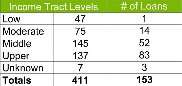
This institution looked at its lending in one dimension: by the census tract median family income level. Are these numbers good or bad? Impossible to tell without context. Here’s an example of how the institution might seek to provide that context:
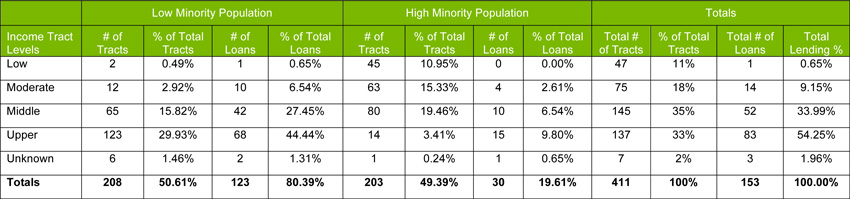
As you can see from the second table, a more thorough fair lending review analyzes the institution’s performance relative to more detailed demographics. For example, what is the institution’s performance relative to population residing in high minority vs. low-minority census tracts and by census tract income level?
In this case, the institution has a heavy concentration of minorities in low-income census tract areas—45 out of 47 low-income tracts, or 95.7% to be exact. Conversely, upper-income census tracts correspond with low-minority census tracts at 123 out of 137 total upper-income tracts, or 89.8%. From a Fair Lending perspective, this is still just the very tip of the proverbial iceberg. The next step is to compare your institution’s lending within these tracts. In this example, you can see that the relative lending to high-minority, low-income tracts appears as low as it can get at 0.00% of total loans compared to the lending to low-minority, high-income tracts at 19.61% of total loans.
Are we in trouble? Still too early to tell, but these numbers are certainly an indicator of the need to dive deeper. This is when we need to explore and expand our analysis in an effort to see whether there is an issue that needs to be addressed or whether there is an underlying explanation. If you’re a credit union, one such explanation may relate to your field of membership, which may limit your lending to certain individuals, areas, or communities. The same principles apply, however, in that you want to show that your lending patterns are reasonable, given your field of membership.
Keeping that in mind, income and minority population are just two of many contextual clues that need to be assessed in order to see the whole picture. A proper investigation would also include a comparison of the pattern of the institution’s lending performance to those of other institutions, to discover where the institution is relative to the market.
Unfortunately, there is no magic button that spits out a fair lending analysis that makes sense for every institution and every circumstance. But taking the time to prepare an analysis that compares your program against contextual factors, such as demographics to peer performance, is vital to painting that picture. Without analysis, the the lending statistics will shape themselves—in potentially unexpected and undesirable ways.


